

Aligning Brand and Digital Experience at Scale
Context
Latitude is is a consumer finance company operating across Australia and New Zealand.
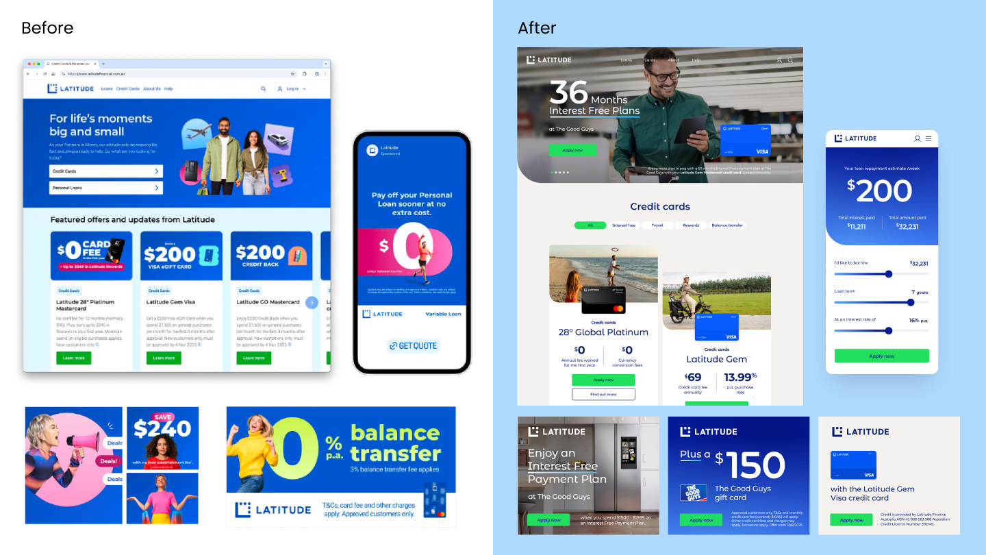
As the company entered a new phase of growth, the brand was evolving to better reflect a more confident and modern financial service provider.
This shift required the brand to be translated into a clear and cohesive experience across marketing, product, and digital touchpoints.
The Challenge
Mismatch in audience appeal
- The legacy visual tone felt overly youthful, tied to earlier buy-now-pay-later products.
- We needed to pivot the brand to resonate with our core growth driver: 'Middle Australia and New Zealand' (ages 30–55)
- Savvy everyday users of credit who desire transparency, control, and to feel empowered
Promotion-led communication
- Much of the marketing focused heavily on pricing and offers, resulting in a transactional brand experience rather than a meaningful one.
Limited customer aspiration narrative
- The brand lacked a deeper articulation of what customers ultimately want to achieve through financial products.
Fragmented design execution
- The absence of a unified visual system led to inconsistent experiences across channels.
Design Objective
The objective was to translate the evolving brand direction into a cohesive and scalable experience system.
Key goals included:
- Establish a visual language that balances credibility and modernity
- Simplify brand expression to improve usability across teams
- Create a flexible system that works across brand, product, and marketing environments
My Role
As Brand × Experience Design Lead, I helped translate the new brand direction into a scalable visual and experience framework.
My contributions included:
- Defining experience and visual design principles
- Leading creative direction across brand and product touchpoints
- Designing key financial product and marketing interfaces
- Developing a modular design system
- Establishing Frontify guidelines to support long-term brand governance
Concept Direction
Anchored by a single, unifying brand idea—'We make it possible'—
the concept focused on bridging the gap between a dependable financial institution and a progressive digital challenger.
The design approach emphasized:
- Meaningful Symbolism: A redesigned logo featuring the embedded 'L' for stability and heritage, alongside three 'possiballs' that speak to the opportunities Latitude opens up.
- Optimistic Palette: Retaining blue as the anchor color, but refining the palette to tonal blues inspired by a 'morning sky' with gentle gradients to evoke the quiet promise of a new day.
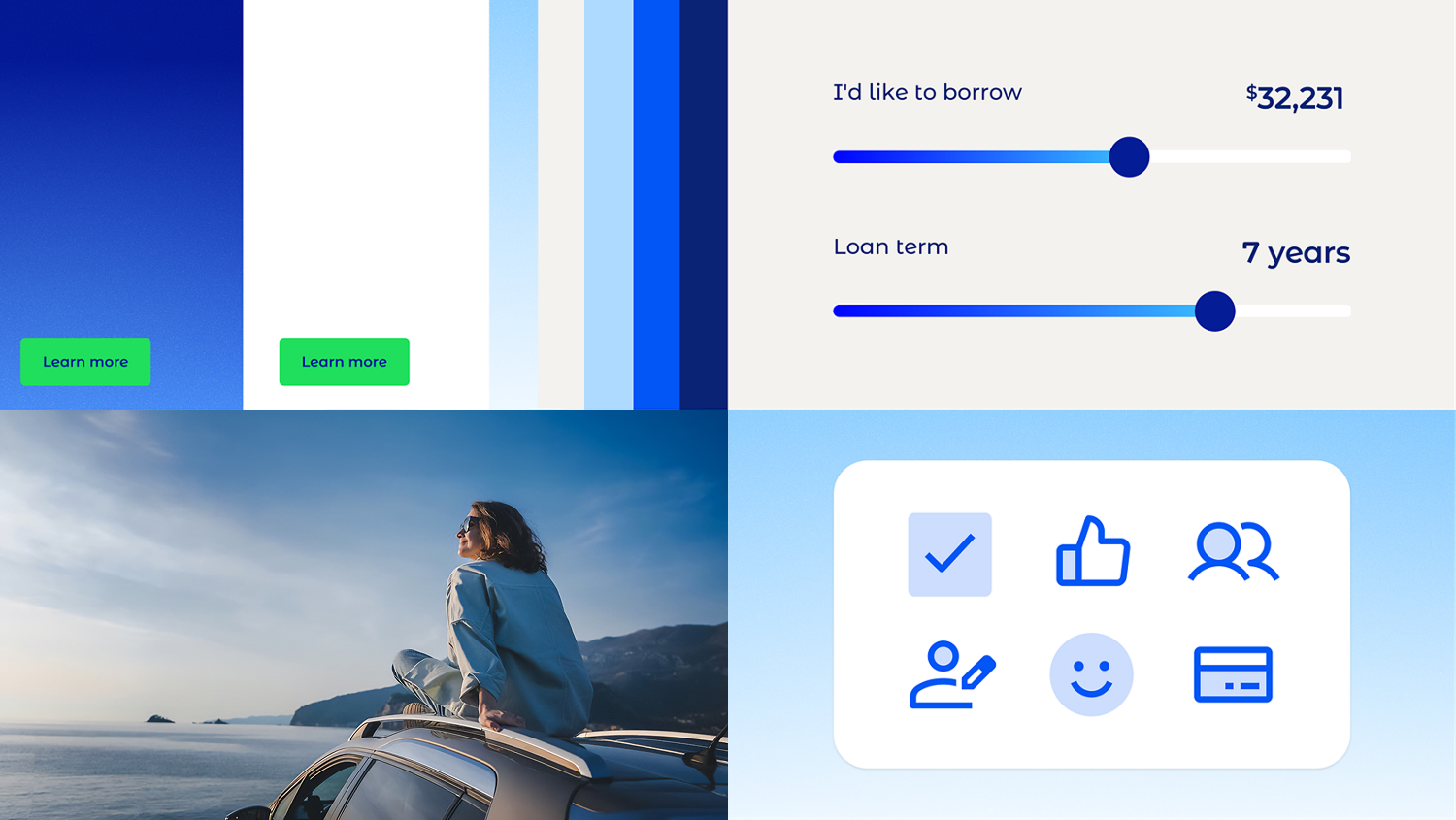
- Bespoke Typography: The creation of 'Latitude Sans', a custom typeface with bespoke rounded numerals designed specifically for a copy-and-number-heavy financial environment.
Experience Framework
To unify the brand across different environments, we developed an experience framework spanning:
- marketing campaigns
- digital interfaces
- corporate communications
This ensured that the brand could be expressed consistently across multiple touchpoints while remaining flexible for different teams and contexts.
Design System
To support long-term scalability and a decentralized marketing model, I helped build a radically simple modular design system. Key features included:
- UI & Typography Integration: Embedding the custom 'Latitude Sans' numerals into core financial interfaces, making numbers feel integrated and unmistakably on-brand.
- Token Management & Modular Components: Established foundational design tokens (color, typography, spacing) and scalable pattern libraries, ensuring seamless multi-platform consistency across web and app environments.
- Purposeful Graphic Devices: Establishing flexible framing systems, including a signature 'underline' treatment used dynamically across digital marketing to highlight key product benefits and reinforce the core "possible" messaging.
- Accessible Color System (WCAG AA): Systematized the new 'morning sky' tonal blues into a rigorous digital palette, meticulously tested to meet WCAG AA accessibility standards for optimal contrast and inclusive usability across all interfaces.
Implementation
The new system was applied across key brand touchpoints including:
- marketing websites
- product experiences
- mobile interfaces
Clear design rules ensured that the brand could scale consistently across platforms.
Guidelines
To ensure governance across cross-functional teams and external agencies, all design principles, accessible UI choices, and the "Possible" messaging frameworks were documented in Frontify.
This created a centralized single source of truth for consistent brand implementation at scale

Outcome
The new framework transformed Latitude’s fragmented brand expression into a cohesive and scalable experience system.
The system improved design consistency, simplified production workflows, and created a foundation for future brand and product experiences.